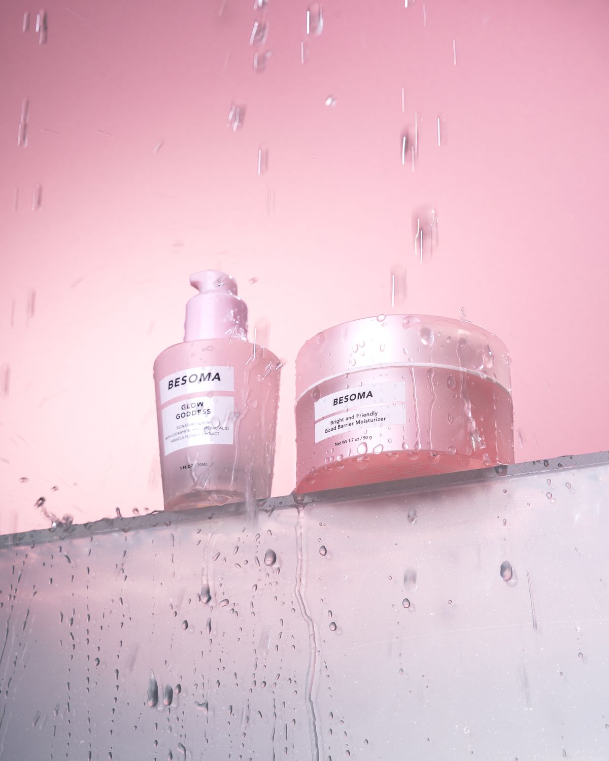
Before reading a caption, I often notice the colors in a beauty photograph. A pink background immediately creates a different visual experience for me than a black, white, or green one.
In this product photograph, the background becomes part of the presentation rather than simply filling unused space. It connects the objects within one composition and gives the image a recognizable mood.
Personally, I associate soft pink with a playful, gentle aesthetic. However, that interpretation is not universal. Someone else might connect the same color with a particular brand, memory, or cultural reference.
This is why I find color choices so interesting in visual communication. Creators can suggest a mood, but audiences bring their own interpretations.
For my own content, I prefer a limited palette that allows the main subject to remain easy to identify. A coordinated background can support the product without competing with it.
Which colors would you choose for a beauty blog?


Leave a Reply